October 20, 2013

Sketch a week.

With all the art I've been doing lately, I've tried to apply some skill practice in my idle time.  I don't get much idle time, but since I don't smoke anymore, I've replaced my smoke breaks with doodle breaks.

Here are the first two Sketches a Week.

1.  Oh God, the Moon: First one is from a photo I found on a website.  I tweaked the proportions quite a bit, focused on the eyes and distorted the nose a bit more to get what could be the first seconds of a Werewolf transformation.

2.  Sandman: Fans of Fox's Sleepy Hollow, a show I am suprised to say is actually pretty good, will recognize the Sandman.  As a fan of this genre, and a big fan of SciFi's Face Off I really find this character design compelling and yet simple.  I tried to capture the creepy-factor.

3. Sammy: Not a sketch of the week, but my daughter Sam, 6, who loves to draw herself, has been watching me draw the 'smooky' stuff.  She informed me tonight that I need to get her a picture to use for some homework that is due tomorrow.  Mom didn't want to give up any of the cuteness we have on the walls, so when Sam turned to me and asked if I would draw it, I couldn't refuse.  Funny thing is, she doesn't think it looks like her....  and I thought I was hard on myself.


October 1, 2013

Artists that I hate so good.

Ok.  Lately I've found my self buried to my useless nipples in work and things that require my time.  When I sit down to draw, it can be very hectic, and I find myself adding to the pressure that already exists.   I step away and go revel, yea, lanquish in the creativity of others.

Under;  ART I HATE SO GOOD, I'll share with you the artists, from who I wish I could leech talent.

The range will be wide and today I start with someone in the middle.

Bosnian-British Comicbook artist...

...Adi Granov. 

Call out the name Adi Granov to comic fans and chances are they will strike the Iron Man “three-point pose” – that iconic striking-the-ground pose (featured in Iron Man Vol 3 #76), which was not only immortalised in polystone by Sideshow Collectibles but is also heavily featured in the Iron Man movies and cartoons

The 36-year-old Bosnian’s breakthrough into mainstream comics came in August 2004 when Joe Quesada (Marvel’s then editor-in-chief) announced his arrival as one of Marvel Comics’ “Young Guns” – a group of artists with the qualities that make “a future superstar penciller”


Why I enjoy his work.


Granov's technique unique and his pieces universally speak to me.  His wardrobes are realistic without feeling pathetic.  Alex Ross often attempts the same thing with spandex, but never quite comes so close to real but heroic like Granov.


Granov has also become the Master of machines in his treatments with Tony Stark's armor.

Realistic forms with smooth and slim anatomy. 

Look at the images belo and compare them to the  metal skin versions of the 80's when Iron Man wasn't the premier Marvel hero, he was everyone's favorite Shellhead.

Check out the Iron nipples...  not really inspiring and it doesn't look all that invincible.


More Great art from Adi Granov


Check out these great links for more artwork and some amazing tutorials.


September 9, 2013

The Joys of Vellum and Colored Pencils

When I was in college, I had several insturctors tell me that I needed to stop using colored pencils...  That, no one made a living with that medium.

Bull.

I've returned to colored pencils with a fury.  Finding new favorite tools in Prismacolor's Col-Erase.  These pencils are awesome.  Not because you can erase them, though that is nice, but because they blend more like graphite pencils.  Traditional colored pencils are waxy and you really have to build up the layers of color, like you would a crayon...  becasue that's all they really are... fine pointed harder crayons. 

Col-Erase pencils blend and shade so nicely.  I now work with a range of 3 similar colors and a black for lining.  I sacrifice colored fingerprints all over my background for gentle and subtle gradations that give my pieces a depth and vibrancy that graphite can not.

I always felt very comfortable with monochromatic mediums like india ink and even sepia oil pastels.  In fact, I would watch as one of the older non-trad students at Longview Community college would craft gorgeous figure studies with that reddish pasty stuff.  To this day, I have little of the skill she used so effortlessly.  These new pencils help though, and I find that i am generally happy with the outcomes.

My advise to school age illustrators...  don't abandon what you are comfortable with...   But also, don't deny yourself new experiences in mediums...  I know my instructors just wanted me to explore.

Take a look.  I will load more of the originals later. 


This is the Vellum I've been working on.
The King of Clubs.

After I get them to this level...  often using several vellums to allow for alternate poses or errors, I scan the images and convert to gray scale.  these will eventually exist on cards and be made to look like sketches on natural parchment.


August 12, 2013

Back at it. Again.

Hey there.  It's been quite for long enough...  long enough to kill most blogs, but We're back at it...

I'll be heading to GenCon in a few days to be a part of Tasty Minstrel's launch of Dungeon Roll.  A record holding dice game from Kickstarter.

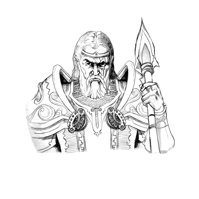
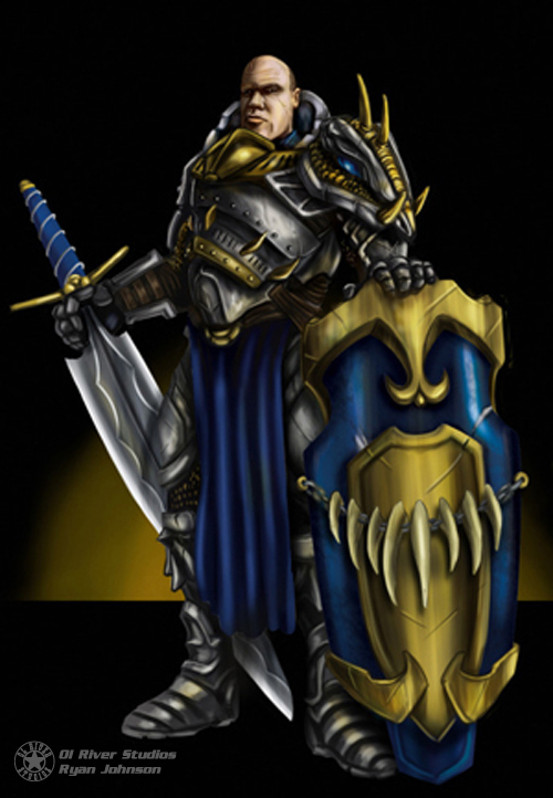
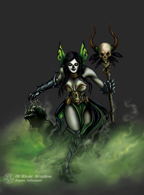
I was fortunate enough to be an Illustrator for the game and I look forward to meeting the fans and interacting with them as a fellow gamer and budding artist.

Im going to light a fire under my compadres as well, since they are all working on things that inspire more than a passing interest.

Check out Dungeon Roll:

Dungeon Roll Kickstarter